6 new mood boards for color and material inspiration
Design Min.

Colors, samples, and materials affect our well-being and, ultimately, our productivity in the office too. To have an impact, a coordinated furnishing concept needs to respond to all sorts of requirements. Just like the Human-Centered Workplace, which focuses on people’s needs.
We developed our mood boards to inspire you creatives when designing workplaces like those. Their purpose is to help you select colors and materials and offer a design toolbox for appealingly matched environments.
Welcome to Pure’s Scandinavian color palette. It encompasses the hues of a sandy beach, the grey-blue ocean, green carpets of moss, and gray stone shades. These are paired with playful pops of color in delicate blueberry purple and pink.

The Earth color palette suggests warmth and a celebration of nature. Fluid-organic forms and high-quality wood elements blend in with the ecological design concept. The warm colors symbolize a celebration of nature and awaken associations with a walk in the forest full of leaves and ripe mushrooms in the fall.

With woody and earthy hues that allude to warmth and nature, McConaghy Properties’ premises in Brisbane, Australia, are all about the Earth color concept.

© Christopher Frederick Jones

An air of spring wafts into rooms furnished around the Greenery color concept. Lush green tones are pepped up by the fresh green of newly sprouting leaves and the delicate hues of flowers and rounded off with wood elements.

With high-quality, classic materials like leather and chrome, Sophisticated is all about tradition contrasted with contemporary accents. The mix of cold and warm colors, as well as diverse surfaces, is invigorating.

The Sophisticated mood board’s colors are reflected tastefully in the interiors at Amber Beverage Group. The interior design’s warm brown tones are inspired by Baltic scenery and reminiscent of bark and amber. They stand for tradition and generate a motivating atmosphere to work in.


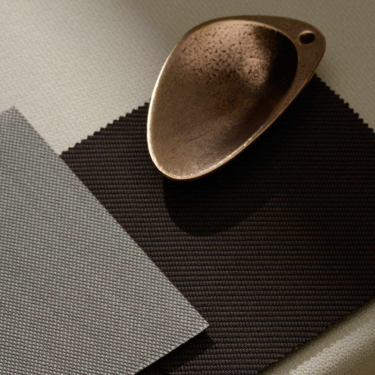
With its understated colors and natural textures, Delicate exudes traditional elegance, underscored by gleaming, copper-colored accessories.

The Delicate color combinations feature in the office building belonging to luxury goods company Richemont in Amsterdam. The natural beige tones of the stylish interior are soothing in the conference rooms and highlight the organic design idiom of the furniture and lights.

© Herman de Winter

© Herman de Winter
Innovative design concepts reflect the digitalization of the working environment. The futuristic Super Real color concept stands for innovation and plays with the concept of soft fabrics and cool, metallic surfaces.

Use our mood boards as a planning tool, be inspired by the harmonious color and material combinations and discover the wide range of design options with furniture from Wilkhahn!